Berkshire Life Case Study
Industry: Disability Insurance
Site: http://www.berkshirelife.com
Description: Created Berkshire Life's online presence to forge a strong emotional connection with each of its target audiences, provide a user-friendly environment and drive key messages for one of the largest disability insurance providers in the nation.
Client Quote
"I'm confident in saying that, by executing Ceonex's plan, we have accomplished our goals... sales leads have more than doubled... In short, I would choose to entrust the production of any of our future web projects to Ceonex"
John Broderick,
Creative Director,
Berkshire Life
view letter
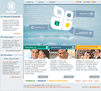
Solution
Color coding
The emotional nature of the topics presented to customers requires thoughtful attention to color, as it plays an integral, if subconscious, role in a user's experience.
The Berkshire Life site uses color and color coding to support a positive emotional connection with each appropriate target audience.
Each product's color scheme, and respective emotional connotation, was carefully considered:
Business disability insurance - blue
The notion of disability resulting in an inability to provide for one's family is difficult to address. Blue is commonly known to be a soothing color and helps to comfort the user as they confront these issues. The color blue is also associated with the concept of loyalty, and as a background reflects Berkshire Life's years of service even through troubled times.
Personal disability insurance - green
Green, a common symbol of hope and growth, works well in conjunction with personal products. Green represents nature, and carries a refreshing and healing connotation appropriate for personal disability.
Insurance professionals - gold
Gold is associated with prosperity, a suitable undertone to communicate to potential insurance agents. Additionally, gold gives the business product line a clear sense of the solid foundation that Berkshire Life provides.
The color scheme planned for Berkshire Life also enhances the overall site structure and acts as a user-friendly tool to orient visitors in the site and help them easily and quickly locate the section they are interested in accessing.